
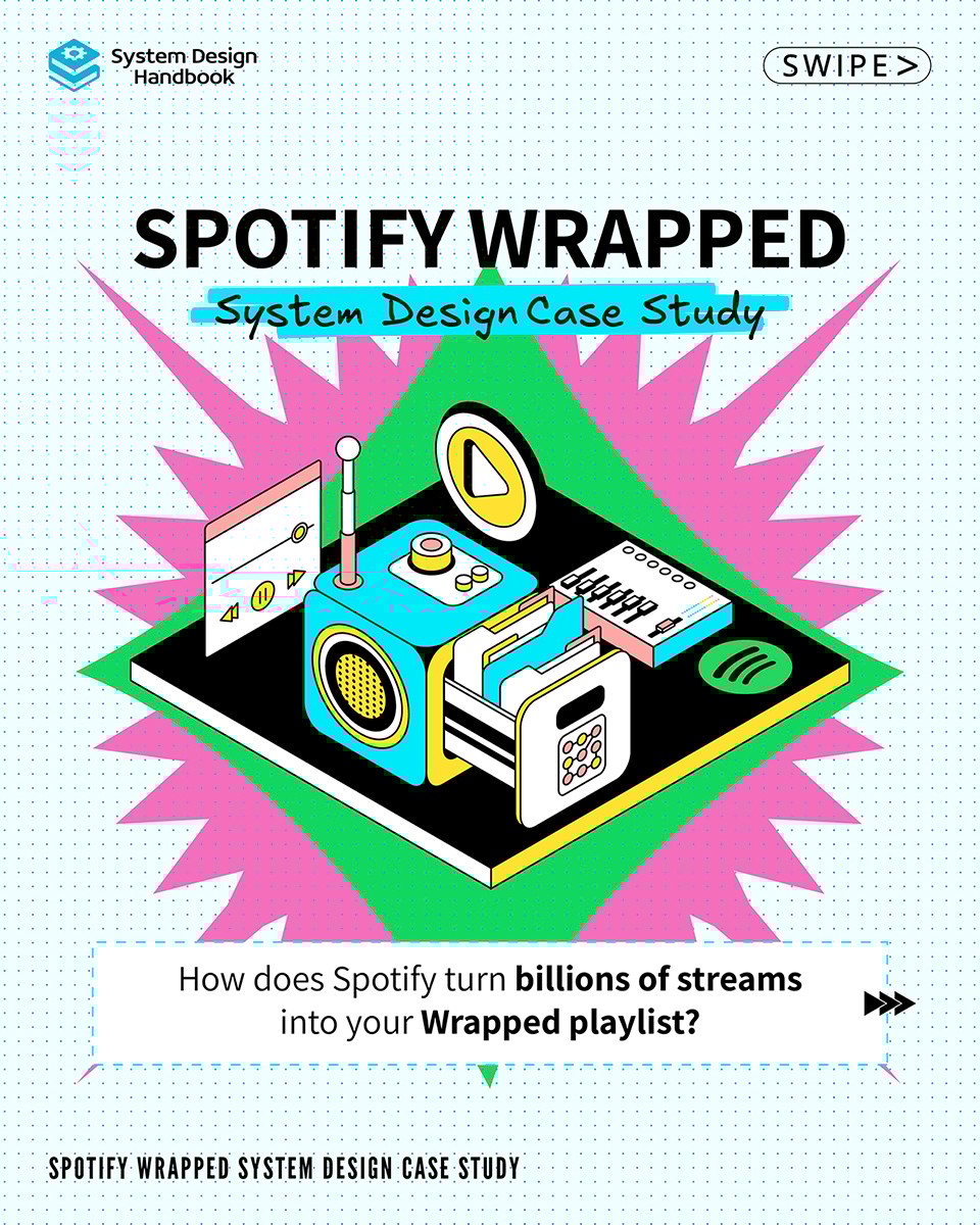
Designing with Devs in Mind
For System Design Handbook, I created this carousel series breaking down the architecture behind Spotify Wrapped.
Swipe through and see how Spotify scaled their Wrapped magic.

Hand-Drawn System Design Cheatsheets
As part of the visual system for System Design Handbook, I designed a series of hand-drawn cheat sheets entirely in Photoshop — each one crafted to break down complex architectures into digestible visuals.
Rather than leaning on sterile, rigid diagrams, I went with an intentionally rough and organic look, mimicking the kind of whiteboard sketches developers are used to seeing (and drawing themselves). Think “drawn in a meeting,” not “rendered in a CAD tool.”
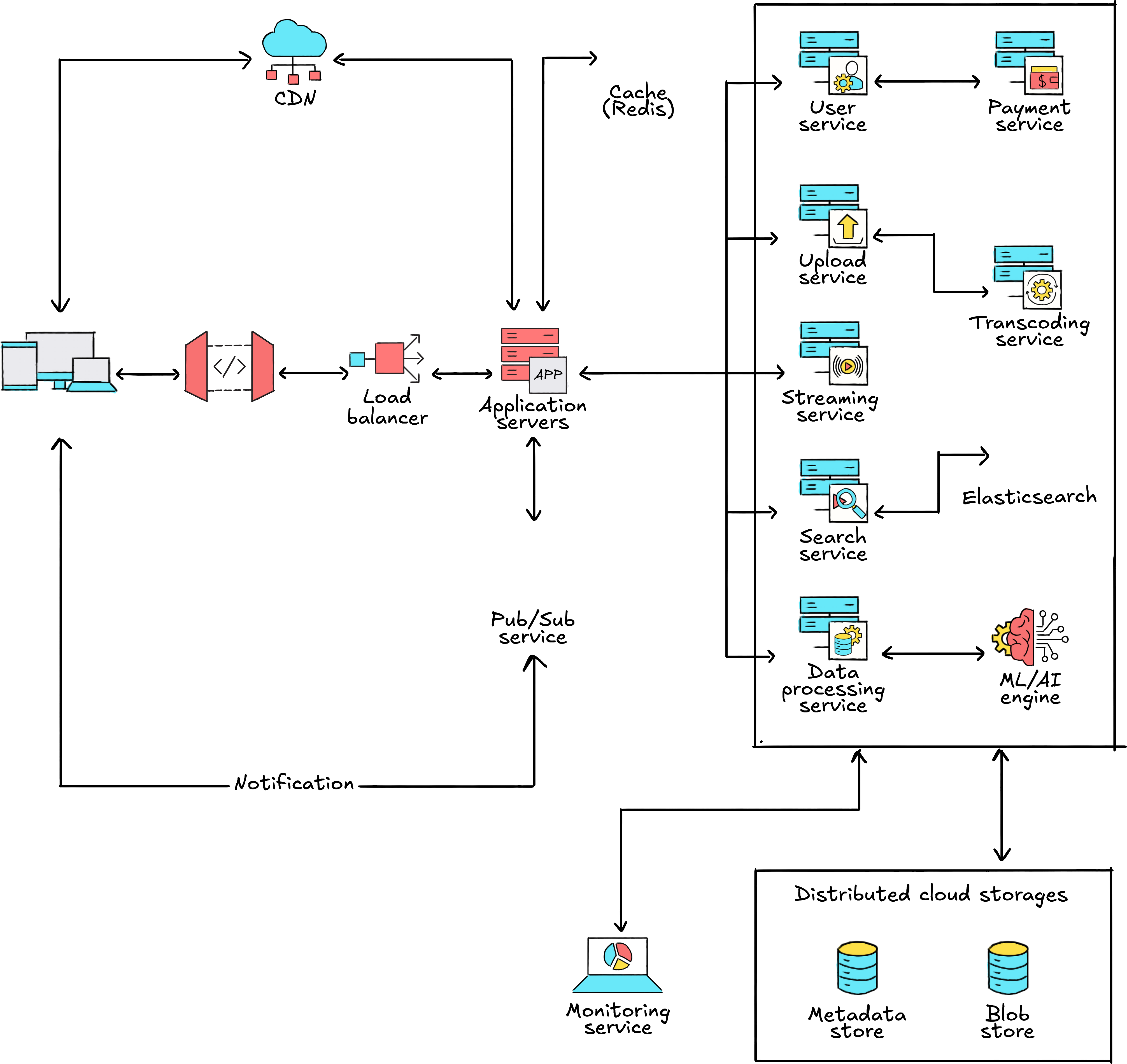
These visuals serve a dual purpose:
- Educational Aid: They help devs visually track data flows, request cycles, and core components without cognitive overload.
- Brand Recall: The distinctive illustration style reinforces the brand’s casual, dev-native tone instantly recognizable in social posts, docs, and carousels.
The goal? Make architecture feel less abstract and more like a blueprint you’d scribble during a team huddle.
The Approach
I took inspiration from how developers naturally think and communicate: whiteboards, napkin sketches, and tools like Excalidraw. That meant leaning into hand-drawn aesthetics, rough lines, marker-style icons, casual labels, to make the content feel more like a conversation than a lecture.
Design Highlights
- Sketch-like Visual Language: Every diagram, icon, and visual asset was intentionally styled to feel like it was drawn during a brainstorming session. This made technical ideas feel more approachable and digestible.

- Content-First UX: The layout is simple, scannable, and scroll-friendly. No bloated effects, no unnecessary friction — just clarity.

Outcome
The microsite has seen a strong reception in the dev community for its simplicity and clarity. It breaks away from the over-designed norm of tech education, speaking in a language that developers are actually comfortable with their own.
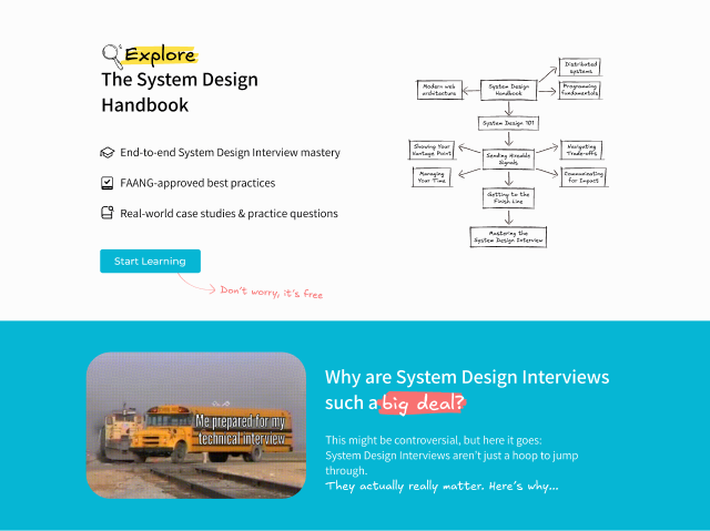
System Design Handbook
A Developer-First Microsite for Educative.io
Overview
Educative.io wanted to launch a microsite to house their premium system design resources in a way that felt accessible, practical, and native to how developers think. I led the branding and UI/UX design for this initiative, everything from visual direction to interactive flow.
The Concept
System design can be intimidating. Diagrams, distributed systems, data flow, all of it often feels too abstract or overly complex. Our goal was to break that down, not just through words, but through how it looked and felt.


Next
Previous
Next
Previous


Designing with Devs in Mind
For System Design Handbook, I created this carousel series breaking down the architecture behind Spotify Wrapped.
Swipe through and see how Spotify scaled their Wrapped magic.
Hand-Drawn System Design Cheatsheets
As part of the visual system for System Design Handbook, I designed a series of hand-drawn cheat sheets entirely in Photoshop — each one crafted to break down complex architectures into digestible visuals.
Rather than leaning on sterile, rigid diagrams, I went with an intentionally rough and organic look, mimicking the kind of whiteboard sketches developers are used to seeing (and drawing themselves). Think “drawn in a meeting,” not “rendered in a CAD tool.”
These visuals serve a dual purpose:
- Educational Aid: They help devs visually track data flows, request cycles, and core components without cognitive overload.
- Brand Recall: The distinctive illustration style reinforces the brand’s casual, dev-native tone instantly recognizable in social posts, docs, and carousels.
The goal? Make architecture feel less abstract and more like a blueprint you’d scribble during a team huddle.
The Approach
I took inspiration from how developers naturally think and communicate: whiteboards, napkin sketches, and tools like Excalidraw. That meant leaning into hand-drawn aesthetics, rough lines, marker-style icons, casual labels, to make the content feel more like a conversation than a lecture.
Design Highlights
- Sketch-like Visual Language: Every diagram, icon, and visual asset was intentionally styled to feel like it was drawn during a brainstorming session. This made technical ideas feel more approachable and digestible.
- Content-First UX: The layout is simple, scannable, and scroll-friendly. No bloated effects, no unnecessary friction — just clarity.
Outcome
The microsite has seen a strong reception in the dev community for its simplicity and clarity. It breaks away from the over-designed norm of tech education, speaking in a language that developers are actually comfortable with their own.
System Design Handbook
A Developer-First Microsite for Educative.io
Overview
Educative.io wanted to launch a microsite to house their premium system design resources in a way that felt accessible, practical, and native to how developers think. I led the branding and UI/UX design for this initiative, everything from visual direction to interactive flow.
The Concept
System design can be intimidating. Diagrams, distributed systems, data flow, all of it often feels too abstract or overly complex. Our goal was to break that down, not just through words, but through how it looked and felt.


Next
Previous
Next
Previous


Designing with Devs in Mind
For System Design Handbook, I created this carousel series breaking down the architecture behind Spotify Wrapped.
Swipe through and see how Spotify scaled their Wrapped magic.

Hand-Drawn System Design Cheatsheets
As part of the visual system for System Design Handbook, I designed a series of hand-drawn cheat sheets entirely in Photoshop — each one crafted to break down complex architectures into digestible visuals.
Rather than leaning on sterile, rigid diagrams, I went with an intentionally rough and organic look, mimicking the kind of whiteboard sketches developers are used to seeing (and drawing themselves). Think “drawn in a meeting,” not “rendered in a CAD tool.”
These visuals serve a dual purpose:
- Educational Aid: They help devs visually track data flows, request cycles, and core components without cognitive overload.
- Brand Recall: The distinctive illustration style reinforces the brand’s casual, dev-native tone instantly recognizable in social posts, docs, and carousels.
The goal? Make architecture feel less abstract and more like a blueprint you’d scribble during a team huddle.
The Approach
I took inspiration from how developers naturally think and communicate: whiteboards, napkin sketches, and tools like Excalidraw. That meant leaning into hand-drawn aesthetics, rough lines, marker-style icons, casual labels, to make the content feel more like a conversation than a lecture.
Outcome
The microsite has seen a strong reception in the dev community for its simplicity and clarity. It breaks away from the over-designed norm of tech education, speaking in a language that developers are actually comfortable with their own.
Design Highlights
- Sketch-like Visual Language: Every diagram, icon, and visual asset was intentionally styled to feel like it was drawn during a brainstorming session. This made technical ideas feel more approachable and digestible.
- Content-First UX: The layout is simple, scannable, and scroll-friendly. No bloated effects, no unnecessary friction — just clarity.


System Design Handbook
A Developer-First Microsite for Educative.io
Overview
Educative.io wanted to launch a microsite to house their premium system design resources in a way that felt accessible, practical, and native to how developers think. I led the branding and UI/UX design for this initiative, everything from visual direction to interactive flow.
The Concept
System design can be intimidating. Diagrams, distributed systems, data flow, all of it often feels too abstract or overly complex. Our goal was to break that down, not just through words, but through how it looked and felt.


Next
Previous