
Illustrations and Animations


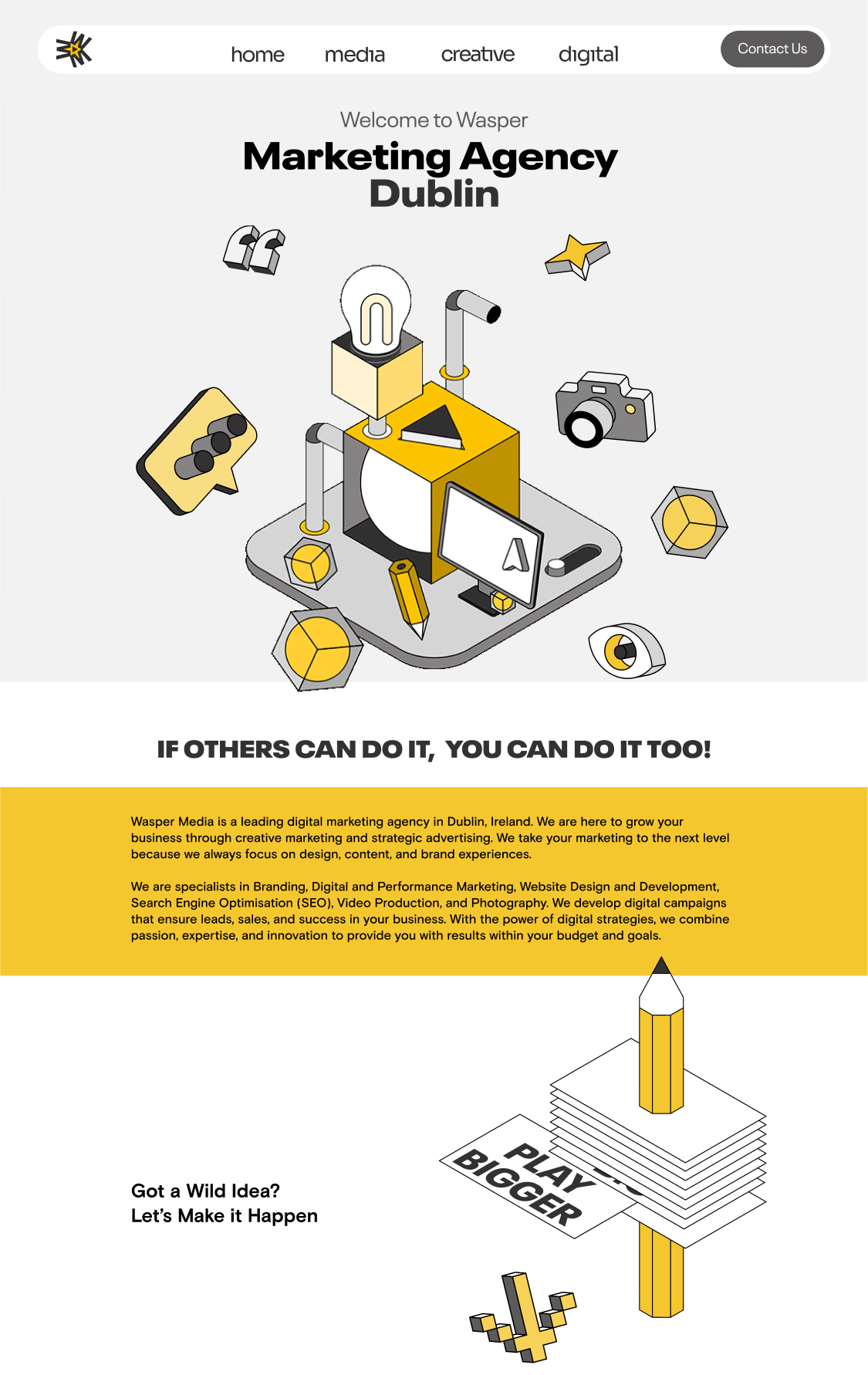
Wasper Media — Landing Page UI/UX
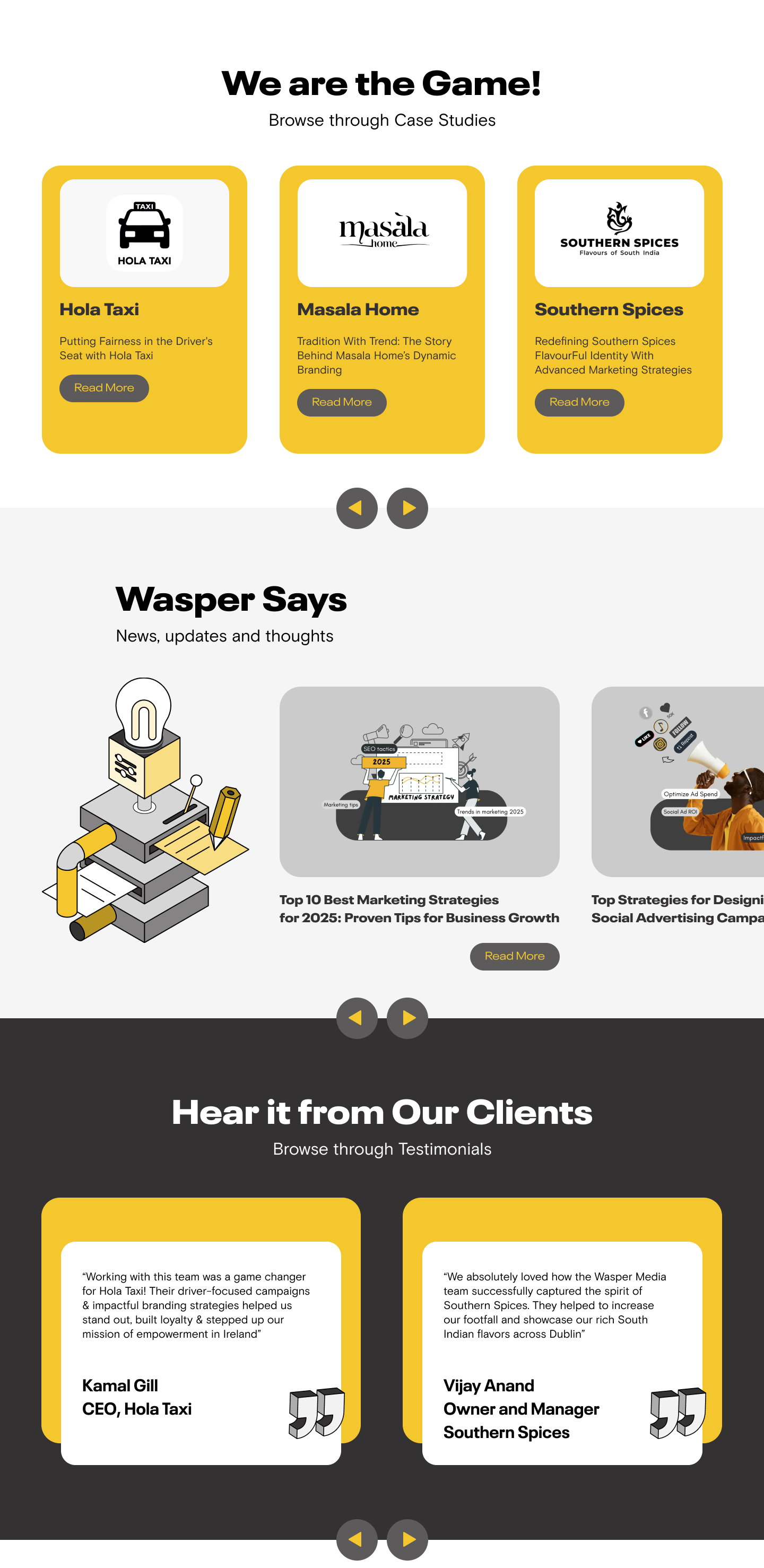
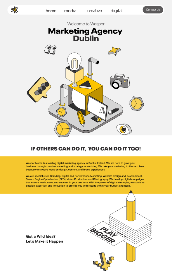
The landing page was designed to be bold, energetic, and conversion-focused — just like the brand.
- Hero Message: Straight to the point. Marketing Agency Dublin, paired with a motivational hook: “If others can do it, you can do it too!”
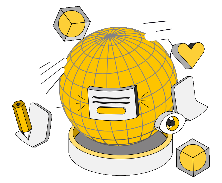
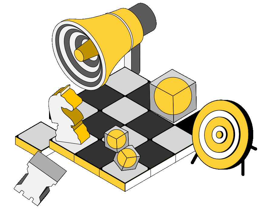
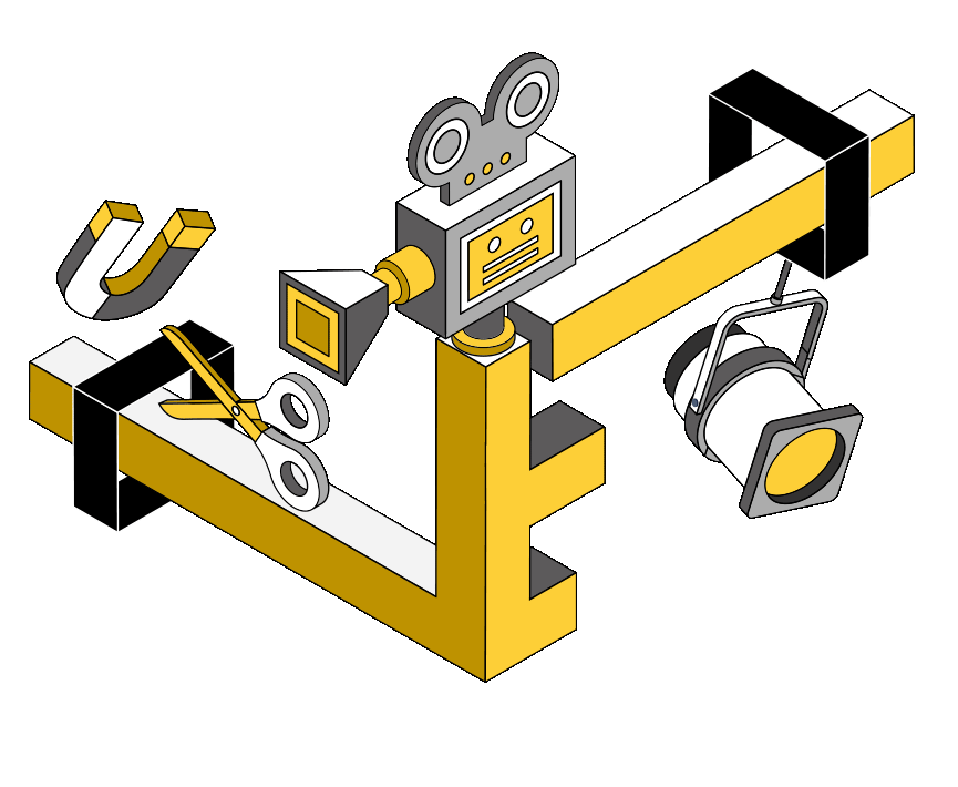
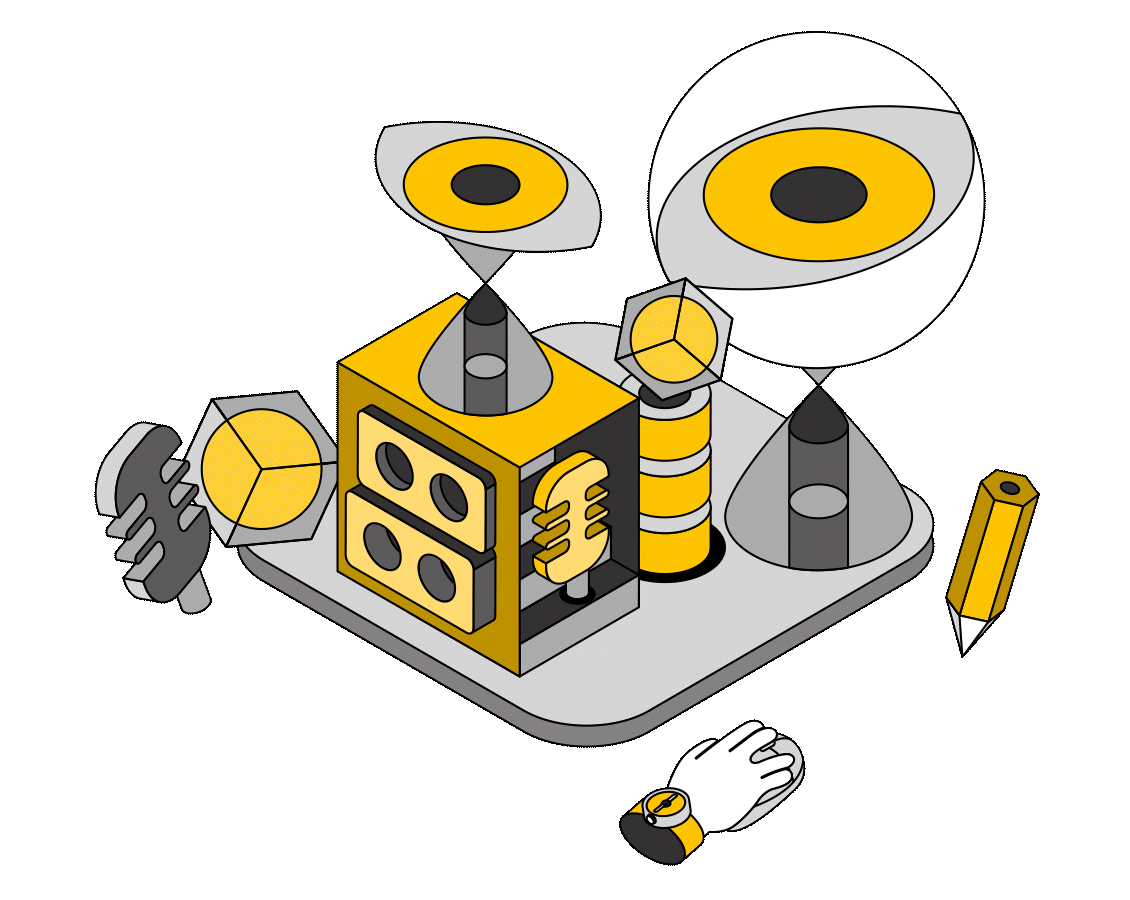
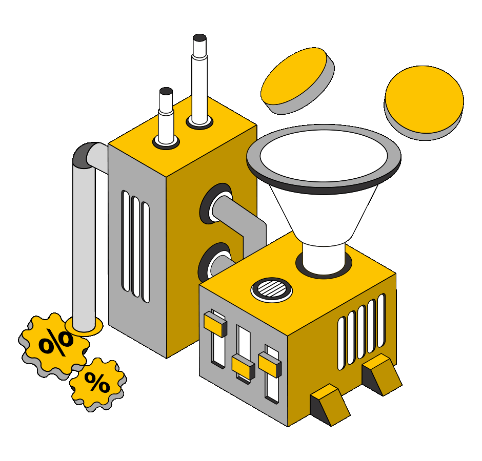
- Visuals: Custom isometric illustrations and a wasp-yellow palette build brand recall and reinforce the creative vibe.
- UX: Clean navigation, strong CTAs, and playful copy guide users toward services and contact without friction.
It’s not just a homepage, it’s a confidence statement.
Wasper Media
Marketing Agency in Dublin
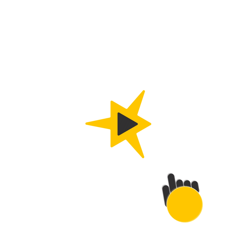
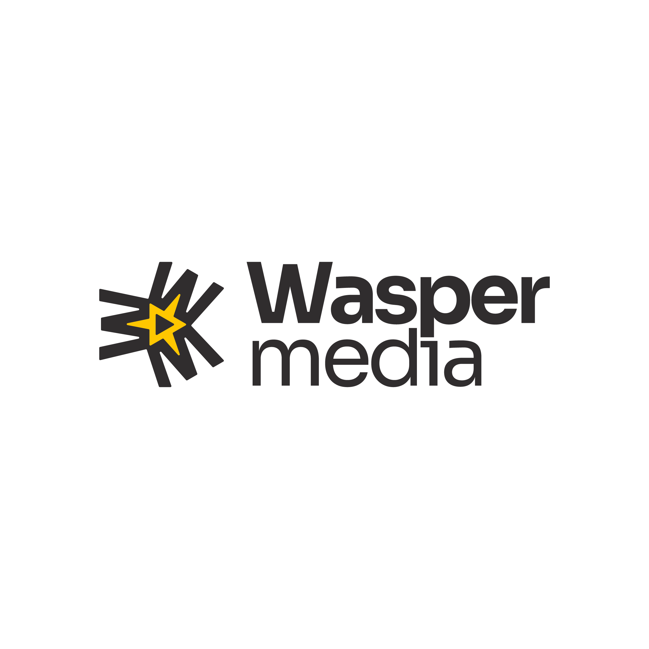
Logo Design and Animation
This animation is intentionally playful yet sharp, making it ideal for social reels, content intros, and branded transitions. It turns a static brand into a living, breathing digital asset.
The Wasper Media logo is designed to represent the dynamic and innovative spirit of the media industry. The symbol in the logo combines a play button and a star within a bold, structured shape, signifying both media interaction and excellence.
The play button signifies the action of media, while the star symbolizes success and the shining quality of the work that Wasper Media delivers. The overall design, with its sharp lines and balanced geometry, captures both motion and precision, aligning with the forward-thinking and creative nature of the brand.
The yellow star draws attention to the focal point of the logo, representing energy and creativity, while the black text provides a professional and bold contrast. The rounded elements of the text and the circular play button contribute to a friendly yet confident brand personality, balancing sharpness with approachability.
Next
Next
Previous

Illustrations and Animations
Wasper Media — Landing Page UI/UX
The landing page was designed to be bold, energetic, and conversion-focused — just like the brand.
- Hero Message: Straight to the point. Marketing Agency Dublin, paired with a motivational hook: “If others can do it, you can do it too!”
- Visuals: Custom isometric illustrations and a wasp-yellow palette build brand recall and reinforce the creative vibe.
- UX: Clean navigation, strong CTAs, and playful copy guide users toward services and contact without friction.
It’s not just a homepage, it’s a confidence statement.
Wasper Media
Marketing Agency in Dublin
Logo Design and Animation
This animation is intentionally playful yet sharp, making it ideal for social reels, content intros, and branded transitions. It turns a static brand into a living, breathing digital asset.
The Wasper Media logo is designed to represent the dynamic and innovative spirit of the media industry. The symbol in the logo combines a play button and a star within a bold, structured shape, signifying both media interaction and excellence.
The play button signifies the action of media, while the star symbolizes success and the shining quality of the work that Wasper Media delivers. The overall design, with its sharp lines and balanced geometry, captures both motion and precision, aligning with the forward-thinking and creative nature of the brand.
The yellow star draws attention to the focal point of the logo, representing energy and creativity, while the black text provides a professional and bold contrast. The rounded elements of the text and the circular play button contribute to a friendly yet confident brand personality, balancing sharpness with approachability.
Next
Next
Previous


Wasper Media — Landing Page UI/UX
Illustrations and Animations


Wasper Media — Landing Page UI/UX
The landing page was designed to be bold, energetic, and conversion-focused — just like the brand.
- Hero Message: Straight to the point. Marketing Agency Dublin, paired with a motivational hook: “If others can do it, you can do it too!”
- Visuals: Custom isometric illustrations and a wasp-yellow palette build brand recall and reinforce the creative vibe.
- UX: Clean navigation, strong CTAs, and playful copy guide users toward services and contact without friction.
It’s not just a homepage, it’s a confidence statement.

Wasper Media
Marketing Agency in Dublin
Logo Design and Animation
This animation is intentionally playful yet sharp, making it ideal for social reels, content intros, and branded transitions. It turns a static brand into a living, breathing digital asset.
The Wasper Media logo is designed to represent the dynamic and innovative spirit of the media industry. The symbol in the logo combines a play button and a star within a bold, structured shape, signifying both media interaction and excellence.
The play button signifies the action of media, while the star symbolizes success and the shining quality of the work that Wasper Media delivers. The overall design, with its sharp lines and balanced geometry, captures both motion and precision, aligning with the forward-thinking and creative nature of the brand.
The yellow star draws attention to the focal point of the logo, representing energy and creativity, while the black text provides a professional and bold contrast. The rounded elements of the text and the circular play button contribute to a friendly yet confident brand personality, balancing sharpness with approachability.
Next
Previous