User Menu Panel
A compact, distraction-free menu that gives users quick access to everything that matters — their progress, performance analytics, demo walkthrough, and logout options. The visual tone stays calm and minimal, with soft colors and a clear progress bar to subtly encourage completion without pressure. Designed to feel personal, not overwhelming.

User Analytics Dashboard
Designed to help medical students track their learning across clinical scenarios. This dashboard highlights what was attempted, when, and how users performed, with quick access to detailed reports and conversation transcripts.
The goal was clarity: clean table layout, soft colors, and minimal friction. Everything is one click away.
Outcome & Reflections
- Students reported feeling more confident initiating patient conversations
- The tool was easy to use with no onboarding required
- Even non-tech-savvy users engaged with it naturally, a sign of good design
“Felt like a safe space to practice without judgment.” – User feedback
Design Solutions

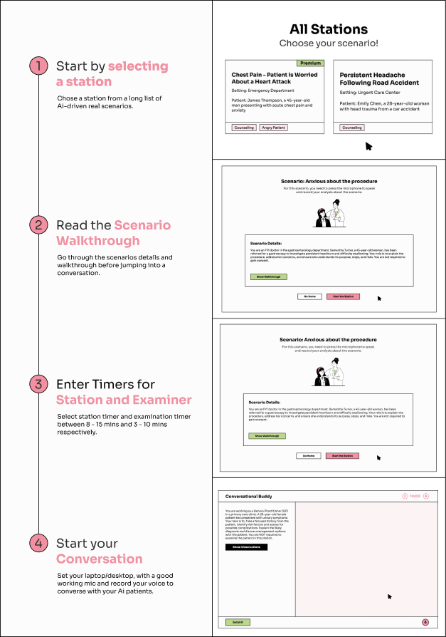
1. Clear Scenario Prompt
The left panel immediately orients the user with a detailed patient case.
It’s readable, structured, and avoids fluff, giving students what they need and nothing they don’t.
2. Uncluttered Layout
The interface is split into two areas:
- Left panel: Scenario context and clinical tasks
- Right panel: AI conversation area
We intentionally left the chat area blank on loadletting the user breathe before diving in. It’s not empty space. It’s mental room.

3. Voice Interaction (Mic Button)
We placed a mic button on the bottom right, keeping it accessible without being intrusive.
It encourages speaking, the most realistic and effective way to prep for OSCE-style assessments.
We avoided clunky speech-to-text feedback and instead prioritized natural interaction with the system.

- Gentle Timing Mechanism
A soft pink timer in the top right creates time awareness without adding pressure.
Pause/play icons let users control their flow, because clinical exams are already stressful enough.
Designing for Clarity: Keeping AI Human-Centered
When designing MLA Buddy, we understood that medical students can easily feel overwhelmed by complicated technical language and the constant push of AI technologies. Many students find artificial intelligence confusing and intimidating.
To help them, we kept our design and wording straightforward and clear. This approach makes learning easier, reduces stress, and better supports students as they prepare for their medical exams.
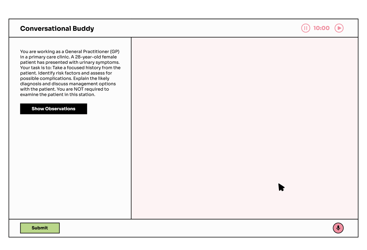
Conversational Buddy
The Conversational Buddy is one of the most critical learning tools in MLA Buddy, designed to simulate real-world clinical conversations that medical students in the UK must master for OSCE-style exams.
We aimed to replicate the mental model of a consultation room without the stress or overcomplication that usually comes with AI-powered platforms.
The Problem
Most AI tools for clinical training focus too much on the tech and too little on the student experience. We noticed common patterns:
- Interfaces that were too dense, too robotic, or filled with irrelevant complexity
- A lack of focus-driven flow, with users unsure when and how to begin
- No clear visual priority, distracting UI patterns that overwhelmed instead of guided
Medical students don’t want to “train with AI.” They want to practice talking to patients.
The Goal
Design an interaction flow that feels:
- Natural, quiet, and clinical
- Focused on the student-patient interaction, not the tool
- Able to guide the user gently, without hand-holding or micromanaging
- Familiar like a real consultation with light tech scaffolding
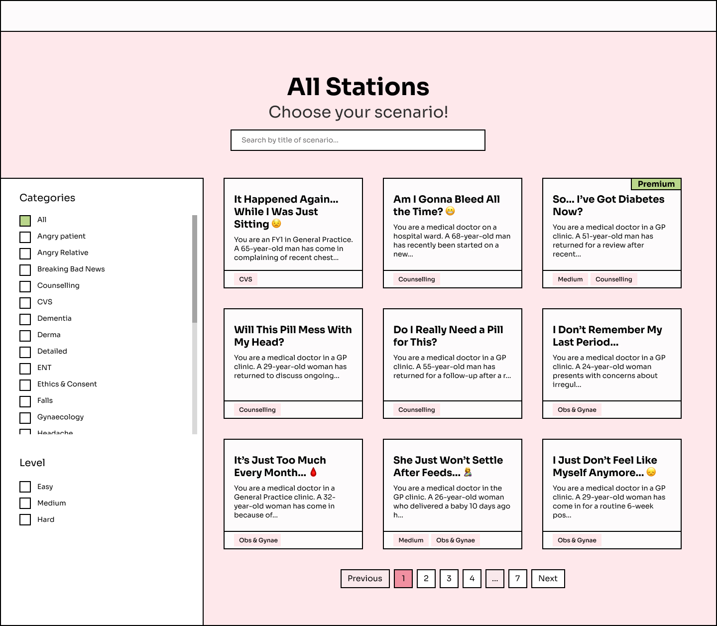
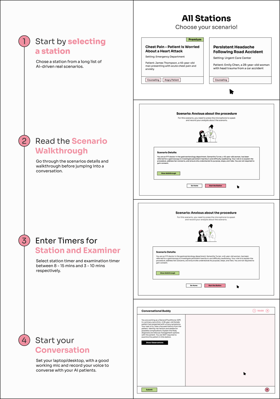
All Stations Page
This page was designed to help users browse and select from a growing library of clinical scenarios. The goal was to make content discoverable, engaging, & easy to filter, for med students with limited time.
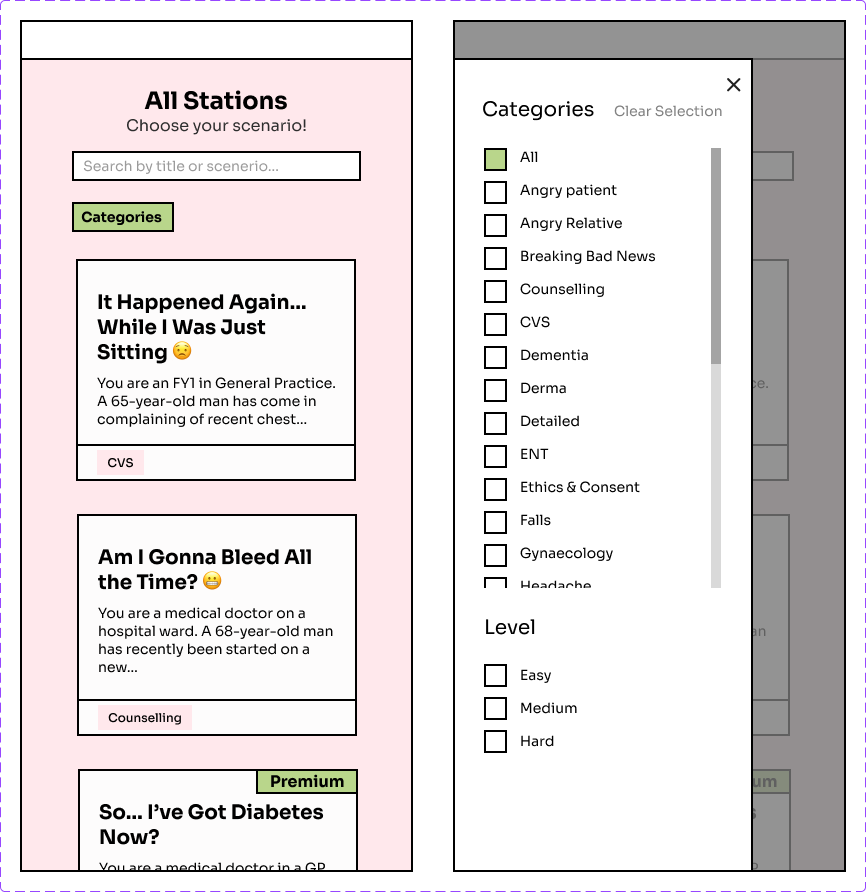
Key Design Decisions
- Grid View with Preview Cards
- Powerful Filters, Simple UI
- Search First Design
User Flow Overview
This flow maps the full learner journey across the MLA Buddy platform, from logging in to completing a station and reviewing performance.

This flow was designed to be modular and intuitive, helping students focus on practicing medicine, not figuring out the platform.
- Users begin at the Landing Page and either sign up via Google or jump straight into practice if already logged in.
- The Dashboard serves as the central hub, allowing access to key features like the scenario library, video demo, and user analytics.
- From Browse Station, learners can select a scenario, view a walkthrough, and start their interactive session.
- Inside the station, users simulate a live consultation: viewing observations, starting conversations, and managing time, just like an OSCE station.
- Once completed, they can submit, give rationale, and receive a performance report to help close the feedback loop.
MLA Buddy
Helping Future Doctors Navigate
the UKMLA
Overview
MLA Buddy is a digital learning platform designed to help aspiring doctors prepare for the UK Medical Licensing Assessment (UKMLA) with ease and confidence.
Built from the ground up by two friends, a developer with the vision, and a designer (me) with the strategic and creative thinking, this product reflects what happens when a real-world problem meets thoughtful design and execution.

My Role
- Product Strategy
- Branding & Visual Identity
- User Experience (UX) Design
- User Interface (UI) Design
- Design System & Component Library


User Menu Panel
A compact, distraction-free menu that gives users quick access to everything that matters — their progress, performance analytics, demo walkthrough, and logout options. The visual tone stays calm and minimal, with soft colors and a clear progress bar to subtly encourage completion without pressure. Designed to feel personal, not overwhelming.

User Analytics Dashboard
Designed to help medical students track their learning across clinical scenarios. This dashboard highlights what was attempted, when, and how users performed, with quick access to detailed reports and conversation transcripts.
The goal was clarity: clean table layout, soft colors, and minimal friction. Everything is one click away.
Outcome & Reflections
- Students reported feeling more confident initiating patient conversations
- The tool was easy to use with no onboarding required
- Even non-tech-savvy users engaged with it naturally, a sign of good design
“Felt like a safe space to practice without judgment.” – User feedback
Design Solutions
1. Clear Scenario Prompt
The left panel immediately orients the user with a detailed patient case.
It’s readable, structured, and avoids fluff, giving students what they need and nothing they don’t.
2. Uncluttered Layout
The interface is split into two areas:
- Left panel: Scenario context and clinical tasks
- Right panel: AI conversation area
We intentionally left the chat area blank on loadletting the user breathe before diving in. It’s not empty space. It’s mental room.
3. Voice Interaction (Mic Button)
We placed a mic button on the bottom right, keeping it accessible without being intrusive.
It encourages speaking, the most realistic and effective way to prep for OSCE-style assessments.
We avoided clunky speech-to-text feedback and instead prioritized natural interaction with the system.
- Gentle Timing Mechanism
A soft pink timer in the top right creates time awareness without adding pressure.
Pause/play icons let users control their flow, because clinical exams are already stressful enough.
Designing for Clarity: Keeping AI Human-Centered
When designing MLA Buddy, we understood that medical students can easily feel overwhelmed by complicated technical language and the constant push of AI technologies. Many students find artificial intelligence confusing and intimidating.
To help them, we kept our design and wording straightforward and clear. This approach makes learning easier, reduces stress, and better supports students as they prepare for their medical exams.
Conversational Buddy
The Conversational Buddy is one of the most critical learning tools in MLA Buddy, designed to simulate real-world clinical conversations that medical students in the UK must master for OSCE-style exams.
We aimed to replicate the mental model of a consultation room without the stress or overcomplication that usually comes with AI-powered platforms.
The Problem
Most AI tools for clinical training focus too much on the tech and too little on the student experience. We noticed common patterns:
- Interfaces that were too dense, too robotic, or filled with irrelevant complexity
- A lack of focus-driven flow, with users unsure when and how to begin
- No clear visual priority, distracting UI patterns that overwhelmed instead of guided
Medical students don’t want to “train with AI.” They want to practice talking to patients.
The Goal
Design an interaction flow that feels:
- Natural, quiet, and clinical
- Focused on the student-patient interaction, not the tool
- Able to guide the user gently, without hand-holding or micromanaging
- Familiar like a real consultation with light tech scaffolding
All Stations Page
This page was designed to help users browse and select from a growing library of clinical scenarios. The goal was to make content discoverable, engaging, & easy to filter, for med students with limited time.
Key Design Decisions
- Grid View with Preview Cards
- Powerful Filters, Simple UI
- Search First Design
User Flow Overview
This flow maps the full learner journey across the MLA Buddy platform, from logging in to completing a station and reviewing performance.
This flow was designed to be modular and intuitive, helping students focus on practicing medicine, not figuring out the platform.
- Users begin at the Landing Page and either sign up via Google or jump straight into practice if already logged in.
- The Dashboard serves as the central hub, allowing access to key features like the scenario library, video demo, and user analytics.
- From Browse Station, learners can select a scenario, view a walkthrough, and start their interactive session.
- Inside the station, users simulate a live consultation: viewing observations, starting conversations, and managing time, just like an OSCE station.
- Once completed, they can submit, give rationale, and receive a performance report to help close the feedback loop.
MLA Buddy
Helping Future Doctors Navigate
the UKMLA
Overview
MLA Buddy is a digital learning platform designed to help aspiring doctors prepare for the UK Medical Licensing Assessment (UKMLA) with ease and confidence.
Built from the ground up by two friends, a developer with the vision, and a designer (me) with the strategic and creative thinking, this product reflects what happens when a real-world problem meets thoughtful design and execution.
My Role
- Product Strategy
- Branding & Visual Identity
- User Experience (UX) Design
- User Interface (UI) Design
- Design System & Component Library

User Menu Panel
A compact, distraction-free menu that gives users quick access to everything that matters — their progress, performance analytics, demo walkthrough, and logout options. The visual tone stays calm and minimal, with soft colors and a clear progress bar to subtly encourage completion without pressure.
Designed to feel personal, not overwhelming.
User Analytics Dashboard
Designed to help medical students track their learning across clinical scenarios. This dashboard highlights what was attempted, when, and how users performed, with quick access to detailed reports and conversation transcripts.
The goal was clarity: clean table layout, soft colors, and minimal friction. Everything is one click away.


Outcome & Reflections
- Students reported feeling more confident initiating patient conversations
- The tool was easy to use with no onboarding required
- Even non-tech-savvy users engaged with it naturally, a sign of good design
“Felt like a safe space to practice without judgment.” – User feedback

1. Clear Scenario Prompt
The left panel immediately orients the user with a detailed patient case.
It’s readable, structured, and avoids fluff, giving students what they need and nothing they don’t.
2. Uncluttered Layout
The interface is split into two areas:
- Left panel: Scenario context and clinical tasks
- Right panel: AI conversation area
We intentionally left the chat area blank on loadletting the user breathe before diving in. It’s not empty space. It’s mental room.
3. Voice Interaction (Mic Button)
We placed a mic button on the bottom right, keeping it accessible without being intrusive.
It encourages speaking, the most realistic and effective way to prep for OSCE-style assessments.
We avoided clunky speech-to-text feedback and instead prioritized natural interaction with the system.
- Gentle Timing Mechanism
A soft pink timer in the top right creates time awareness without adding pressure.
Pause/play icons let users control their flow, because clinical exams are already stressful enough.
Design Solutions


Designing for Clarity: Keeping AI Human-Centered
When designing MLA Buddy, we understood that medical students can easily feel overwhelmed by complicated technical language and the constant push of AI technologies. Many students find artificial intelligence confusing and intimidating.
To help them, we kept our design and wording straightforward and clear. This approach makes learning easier, reduces stress, and better supports students as they prepare for their medical exams.
Conversational Buddy
The Conversational Buddy is one of the most critical learning tools in MLA Buddy, designed to simulate real-world clinical conversations that medical students in the UK must master for OSCE-style exams.
We aimed to replicate the mental model of a consultation room without the stress or overcomplication that usually comes with AI-powered platforms.
The Problem
Most AI tools for clinical training focus too much on the tech and too little on the student experience. We noticed common patterns:
- Interfaces that were too dense, too robotic, or filled with irrelevant complexity
- A lack of focus-driven flow, with users unsure when and how to begin
- No clear visual priority, distracting UI patterns that overwhelmed instead of guided
Medical students don’t want to “train with AI.” They want to practice talking to patients.
The Goal
Design an interaction flow that feels:
- Natural, quiet, and clinical
- Focused on the student-patient interaction, not the tool
- Able to guide the user gently, without hand-holding or micromanaging
- Familiar like a real consultation with light tech scaffolding
All Stations Page
This page was designed to help users browse and select from a growing library of clinical scenarios. The goal was to make content discoverable, engaging, & easy to filter, for med students with limited time.
Key Design Decisions
- Grid View with Preview Cards
- Powerful Filters, Simple UI
- Search First Design
User Flow Overview
This flow maps the full learner journey across the MLA Buddy platform, from logging in to completing a station and reviewing performance.
This flow was designed to be modular and intuitive, helping students focus on practicing medicine, not figuring out the platform.
- Users begin at the Landing Page and either sign up via Google or jump straight into practice if already logged in.
- The Dashboard serves as the central hub, allowing access to key features like the scenario library, video demo, and user analytics.
- From Browse Station, learners can select a scenario, view a walkthrough, and start their interactive session.
- Inside the station, users simulate a live consultation: viewing observations, starting conversations, and managing time, just like an OSCE station.
- Once completed, they can submit, give rationale, and receive a performance report to help close the feedback loop.


MLA Buddy
Helping Future Doctors Navigate
the UKMLA

Overview
MLA Buddy is a digital learning platform designed to help aspiring doctors prepare for the UK Medical Licensing Assessment (UKMLA) with ease and confidence.
Built from the ground up by two friends, a developer with the vision, and a designer (me) with the strategic and creative thinking, this product reflects what happens when a real-world problem meets thoughtful design and execution.
My Role
- Product Strategy
- Branding & Visual Identity
- User Experience (UX) Design
- User Interface (UI) Design
- Design System & Component Library